
Home › Forums › From Data to Dashboards Summer 2020 › Discussion 4 › Reply To: Discussion 4
>> Have you encountered many/any box-and-whisker plots in the course of your work? On other dashboards?
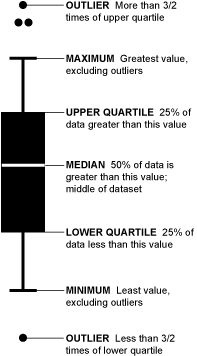
I’ve encountered box-and-whisker plots in my work, but to be entirely honest, have always had a difficult time deciphering what’s what. I’ve found the leading diagram on this site, with explanations, particularly helpful and a useful reference/reminder:
https://flowingdata.com/wp-content/uploads/2008/02/box-plot-explained.gif
As for where, most commonly I’ve seen box-and-whisker plots used in presentations of clinical trial data in study reports, manuscripts, and medical journals. Closest I’ve seen to use within a dashboard, although not a dashboard, has been in abstracts and/or on research posters.
>> What about histograms?
Until this course, I’d not tracked the difference between a histogram and a bar graph. Imagine I’ve seen them, yet not known they were their own entity.
>> If you have little or no prior experience with them, do you think they are easy to understand? If not, can you think of some alternate ways to display distribution data?
Box-and-whisker plots are likely tough to follow, especially for the first-timers or readers who are familiar, but have less experience with them. That said, I think histograms do a nice job of presenting distribution data, albeit with fewer criteria. Side-by-side histograms, as a rough means of comparison could be leveraged. If too cumbersome and/or there is not enough space, that’s where box-and-whisker plots allow you the flexibility of presenting distribution data in parallel for ease of comparison.